Published: Apr 13, 2024 by Jesse Lane
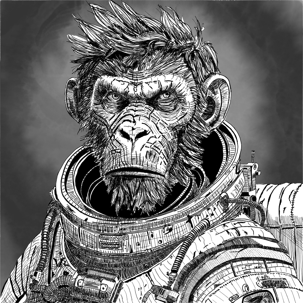
Space Monkey
Here is my second drawing! This one took much, much longer and I’m also much prouder of my work.
The story behind this drawing is that when my children were growing up and teaching themselves to draw, they would often come to me and ask what they should draw. My answer was invariably, “a space monkey”. I don’t know why, but it was always a space monkey. Turnabout, as they say, is fair play. When I decided to start drawing and asked for suggestions, they said, “a space monkey”. So here we are.
The Process
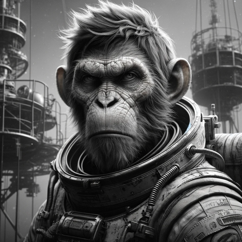
This one is, again, digital “ink” on a tablet using Adobe Fresco. I am not yet good enough to design and compose drawings from scratch so I needed a reference. I worked with ChatGPT to generate a few ideas and chose my favorite, which turned out to be this guy.
I started with a simple “pencil” sketch to lay out the shapes and proportions.
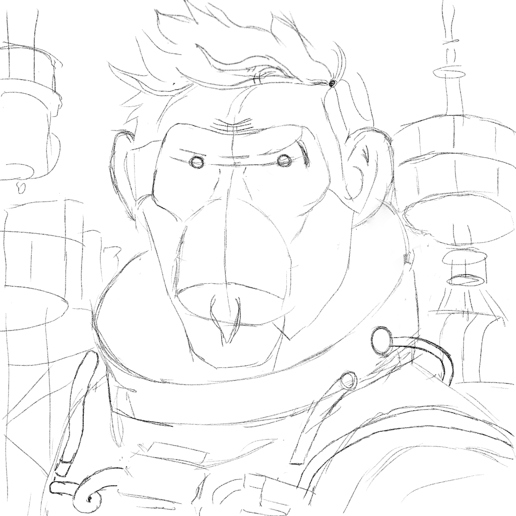
You can see in the sketch that I had originally intended to draw the towers in the background of the reference. However, I didn’t think they added that much to the overall image and the level of detail I ended up with on the figure was WAY more than I had originally intended. So I left them out.
Using the sketch as a guide, I drew the line drawing.
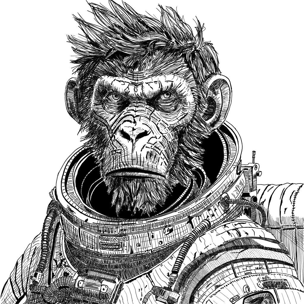
Finally, I really liked the halo effect in the background of the reference image. I also thought the figure was a little flat and missing something. So I used digital water color to create a background layer with a halo-like effect.
What I think I did well
- I fell that I nailed the look, shape, and proportions of the figure. There are some obvious differences, but I think I captured the essence of the reference.
- I think I did a good job shading the face and playing with methods of hatching and contouring.
- I’m really happy with the background. I think it adds a lot to the image.
What I think needs more work
- I think I (again) fell into the trap of too much detail. On the other hand, I kind of like that detailed, gritty style à la Moebius.
- The values on the suit didn’t quite come out right. The front of the suit is too light where it comes down from the left shoulder. Part of the reason is because I fell in love with the regular hatching pattern I was using and was afraid that too much hatching would destroy the impression that the suit was white.
- The hair ended up looking rather more cartoony than some of the rest of the drawing. Part of that is because it’s the first time I tried to draw somewhat realistic hair and I have no idea what I’m doing. The other part is that I was using black ink on a white background and being a stickler about it. So the only way to get light values is to leave white space.
What I learned
- I learned what cross contour shading is and how to use it to give a more 3D look to the figure. I learned while trying to figure out how I was going to shade those ears. I think I did great for my first time out at it.
- I learned that I’m not, and shouldn’t be, as afraid of figure drawing as I started out being. I’m still not sure it’s something I want to continue doing, but I’m not going to assume I can’t do it.
- I learned more about drawing at higher levels of detail. On the one hand, I have the patience for it and even enjoyed sometimes getting lost in one little corner of the image. On the other hand, drawing with too much detail takes forever and I think the amount that I learned, compared to the amount of time I spent, was not the right balance for a beginner.
This particular drawing took me about a month to complete while working an hour or so most week days. It then took me another month or so to finally post it. I was traveling quite a bit and just didn’t find the time. My drawing practice has also suffered (which is dumb because I could be using actual paper and ink and taking it with me).
I have another detailed and time consuming drawing coming that is part of a “contest” between myself and our 13 year old he wanted to have. It will be a skyline of Manhattan with the Empire State Building as the subject. What I am not going to do this time is maniacally work that drawing straight through. Instead I’m going to work on it when I feel like it while interspersing many exercises and smaller/simpler drawings. I’ll post some of those, hopefully more often, as I go.
