Published: Feb 20, 2024 by Jesse Lane
White Church
Ok, here we go, my very first drawing! I’m pretty happy with how it turned out. I really surprised myself! The subject is an (unknown to me) white church somewhere in Charleston. Here is the original reference photo from Unsplash.

The Process
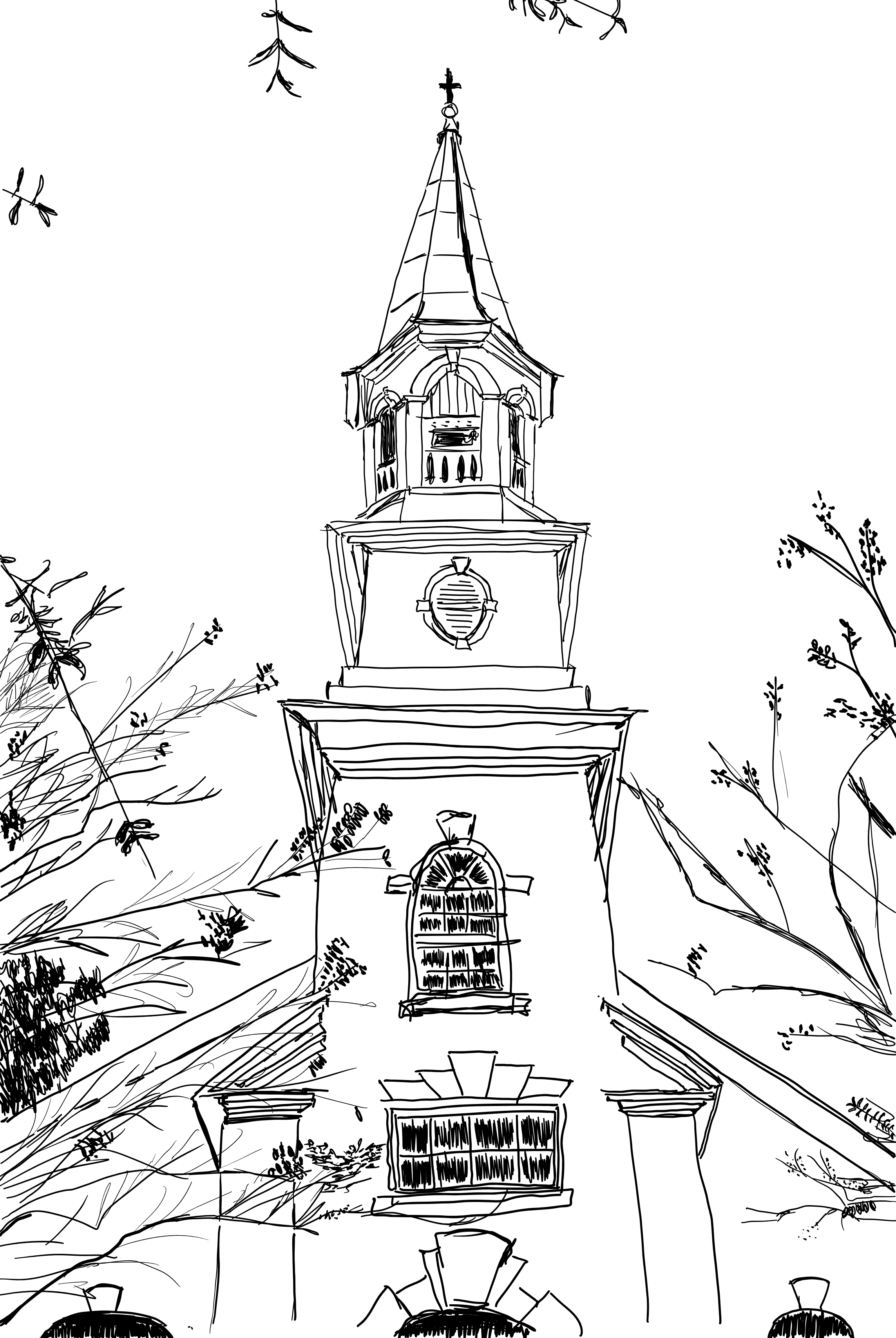
I drew it in digital “ink” on a tablet using Adobe Fresco. I decided I would try to play with different methods for shading/coloring. I started by drawing the following plain line drawing:

I then shaded the drawing using hatching on a separate layer:

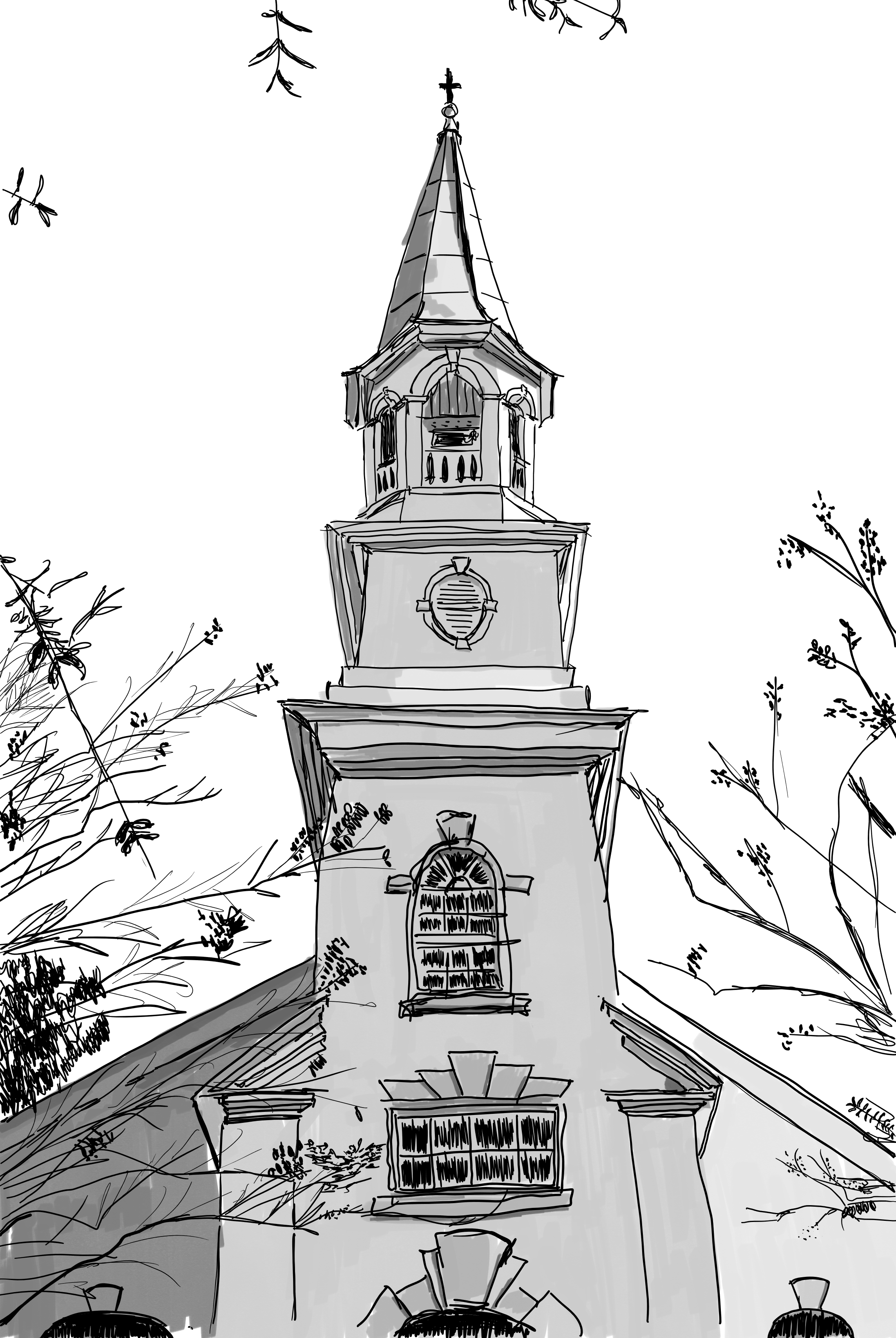
I added a layer of gray scale shading with a “marker” brush:

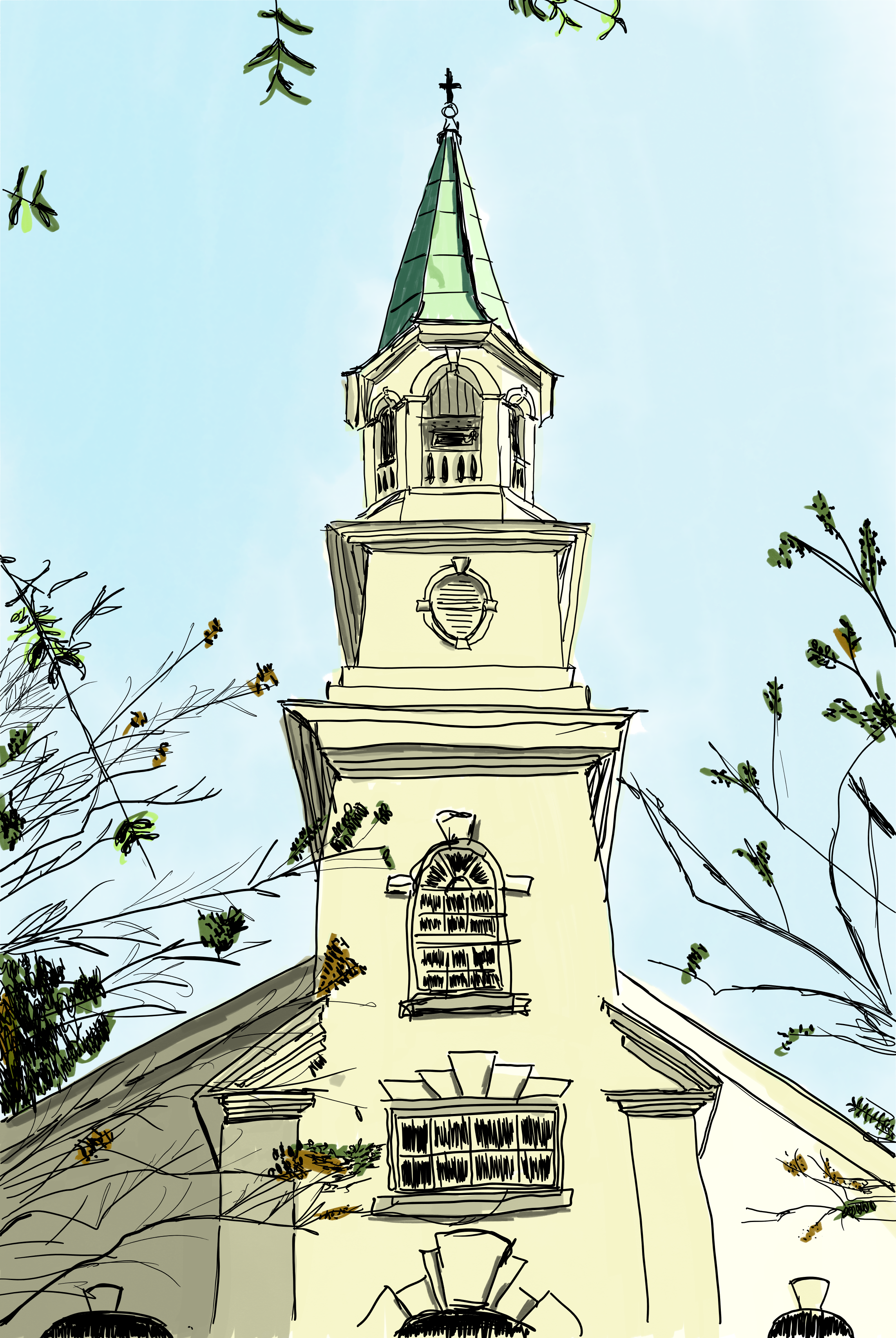
Finally, I added a layer of color:

What I think I did well
- This is the first picture I’ve tried to draw since a high school art class. I’m pretty happy with how it turned out.
- I think I did a pretty decent job of getting the proportion and perspective reasonably right.
- The values are decent.
What I think needs more work
- My line work is not great. I was a bit lazy and too forgiving in telling myself I was trying to be a bit “gestural”. Especially with the little eaves and detailing.
- The vertical lines of the church are not straight so it looks like the church has a bit of a lean. Similarly, the conical top is bent.
- The colored layer is too yellow. I had already done the gray scale, so I wanted slightly more color. I think I overdid it.
- There are some branches and leaves that are much closer where I drew the leaves larger, but didn’t scale up the branches, so they don’t actually look closer. I also didn’t really shade or give any depth to the foliage which negatively impacts the impression of directional lighting.
What I learned
- I chose this picture to start with because it was rather simple. However, while this made the line drawing slightly easier (maybe), I found it harder to get the shading right since there were large facets of the same value. So the end result doesn’t really feel like it has much depth.
- While my hatching is OK, I only used parallel lines for each face. I don’t think I trusted the viewer’s eyes to distinguish the shaded areas if I really went at it with the hatching. I should have known better since I’ve seen this done well in other drawings.
- I caught myself drawing what I thought I saw instead of what I actually saw when it came to the windows. If I went back and redrew the windows I would draw black panes with white space in between them for the frames. The lower set also has a reflection of trees in them. I didn’t draw that at all.
- I was also trying to figure out my workflow with the tablet and the software. I purposely spent very little time futzing around with finding the perfect brushes (how would I even know?) or discovering everything Fresco can do. I did change the ink brush size, but I don’t think it was very effective. However, this image also doesn’t have a large variety of depths, so the trick of using a thinner line for further away objects wouldn’t have been very useful here. Instead I used it for finer branches and details.
